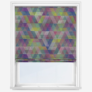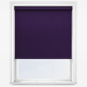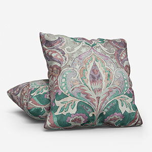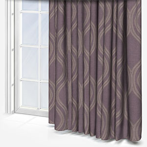
Colour Focus: Royal Purple & The Platinum Jubilee
The jubilee weekend is well underway and what could be a more fitting topic for an interior design blog than royal purple? This is an amazing colour that harmonises with a wide range of other tones, materials, and design trends. Read on to learn all you need to know about using royal purple!
Why is purple royal?
In many of our blogs and in conversation, purple as a whole colour is often referred to as royal, but why is this? To understand the reasoning behind this noble epithet we must travel back in time – a long way back in time…
In the ancient world, people across the globe loved to use colour but in a pre-mass manufacturing age, purple was the hardest colour to create. In the Roman world, purple dye was made from rare snails which was extremely expensive. This celebrated Tyrian purple was the preserve of the Roman kings, and once they were booted out, senators were allowed to wear only a purple stripe on their togas. Purple really was a big deal in the ancient world!
This majestic reputation was adopted throughout the medieval and early modern eras through to the present day. While purple is no longer the legally protected reserve of the nobility, we still associate purple with a feeling of grandeur and sophistication.
What is royal purple specifically?
Royal purple is a chic shade of blue-magenta. It’s soft yet powerful, with an underlying richness to it. While clearly purple, the blue undertone to the colour makes it also flexible. Royal purple’s closest relatives are shades of plumb, violet and lavender.
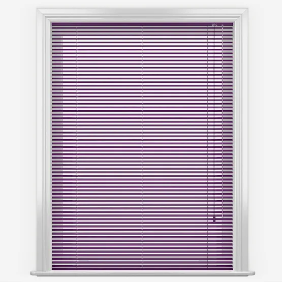
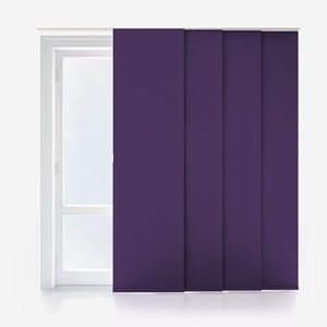
Royal purple has been a popular colour in many aspects of life from sweet wrappers to clothing and home furnishings. In interior design, royal purple works well as a dominant colour in a space, through to a secondary supporting role.
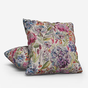
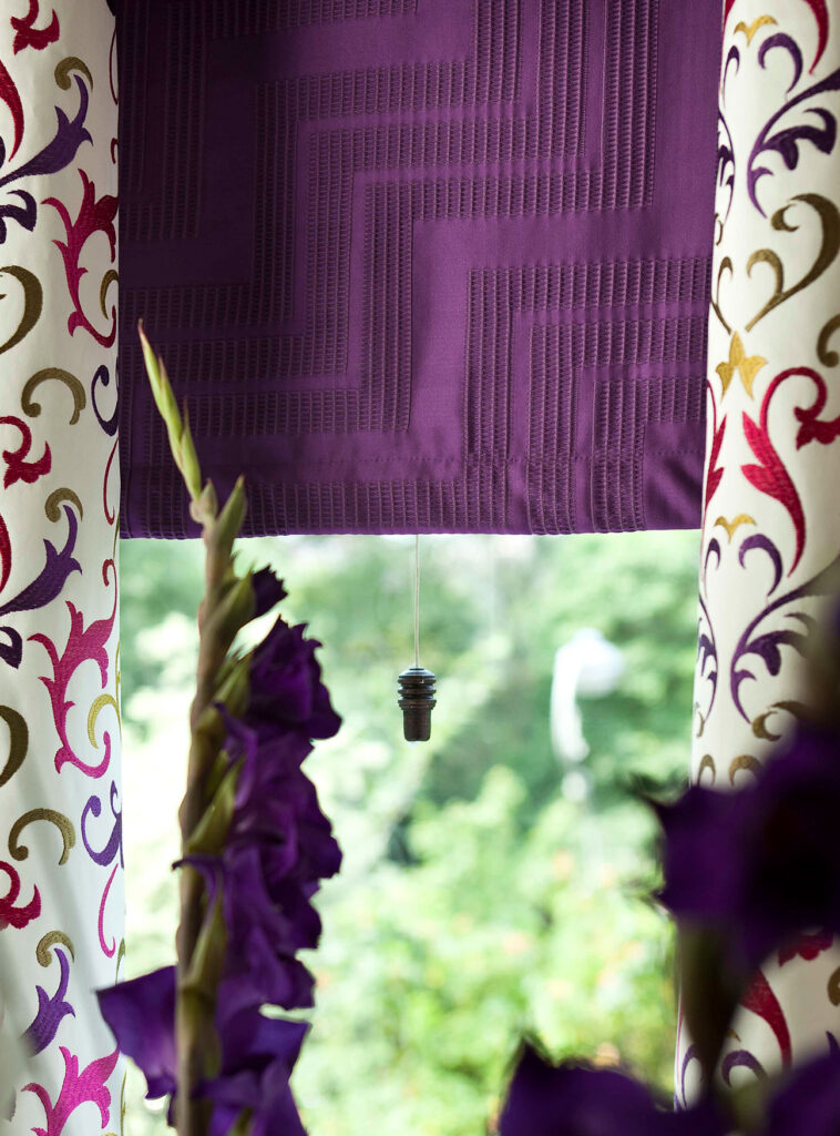
Royal purple curtains in a high-quality velvet set within a cool, off-white space with matching purple lamp shades and cushions will make a room feel chic and welcoming in equal measure.
Which colours go with royal purple?
Royal purple is a great colour to use as part of an exciting and dynamic colour palette. Below, we’ve pulled together our top three perfect partners for royal purple!
Royal purple and platinum
We’re not only referencing this because it’s Her Majesty’s platinum jubilee, but it’s also actually an amazing partnership. Royal purple and platinum are both well known for their regal natures, but combined, they really shine. The main reason for this, beyond the lovely contrast of the brilliant silver and eye-catching purple, is the saturation of the later, and the shimmer of the former. Metallic tones are eye-catching in a different way to juicy non-metallic colours and few combinations will ever be as sophisticated as royal
Royal purple and cream
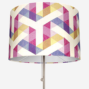
Purple and cream offer style conscious decorators the opportunity to create something that’s exciting, fresh and captures a characterful traditional style. Similarly to royal purple and platinum, using cream offers an excellent contrast between the colours to make each standout, but in a softer way. A lighter cream will help make a space feel modern and contemporary whereas a richer, warmer tone will make it look classically chic. Consider using purple and cream as part of a pattern for the best effect.
Royal purple and teal
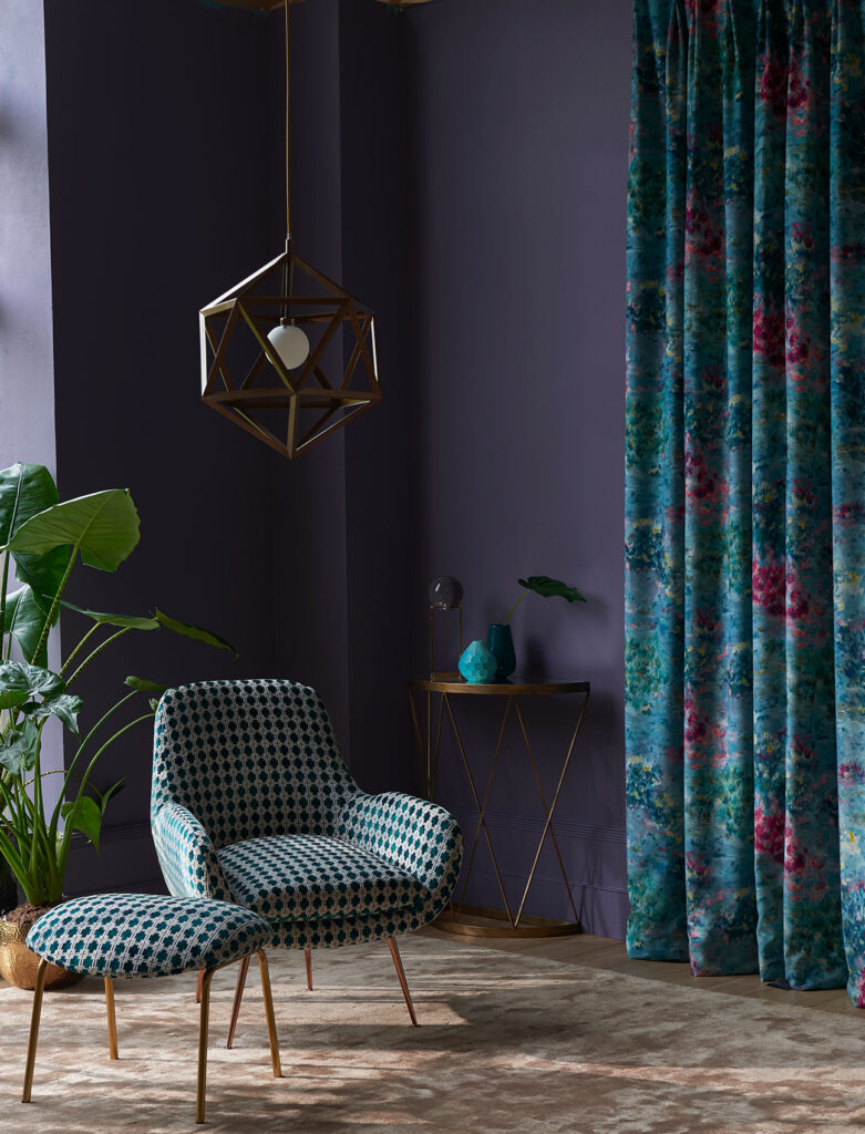
For a space that’s modern, fun and punchy, add shades of teal to your royal purple decor. Teal and purple both have blue undertones so combining the two in a space will be sure to make it pop. Using bright, juicier shades of teal with accents of royal purple, will make sure the space doesn’t become too overbearing – especially if you use purple home accessories. You could even add in shades of soft neutrals to break up the space in a supremely chic and stylish way!
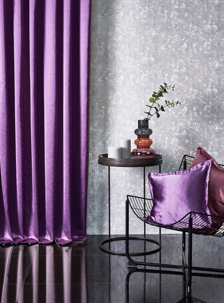
Royal purple is a fantastic colour and it’s no surprise this tone is associated with the rich and powerful throughout history. To ensure you find the perfect shade of purple, and any supporting colours you pick, don’t forget you can order up to eight free samples to see your options in the flesh!
Shop some of our products inspired by royal purple:
