Colour Focus: Which Colours Go With Beige?
For too long, the word beige has been synonymous with bland, but this epithet is not deserved. A beige aesthetic, and all the wonderful tones it can include is an extremely versatile colour which you can use to great effect in your home. Here’s some top tips for which colours go with beige!
The bounty of the beige colour
It’s hard to pick a colour that’s as flexible as beige which is why there are plenty of options for colours that go with it. With a great selection of tones, shades and hues, there is hardly a colour on the spectrum that can’t be enhanced by it. From juicy, almost neon greens to cool shades of grey, they can all be helped to merge seamlessly into your décor with the support of beige. Celebrated interior designer Albert Hadly said, “Beige is atmosphere. It’s bisque, it’s ivory, it’s cream, it’s stone, it’s toast, it’s cappuccino. It’s well… it’s magic.” Therefore, lets take a look at these shades, and see which colours go best with beige colour shades.
What colours go with bisque?
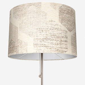
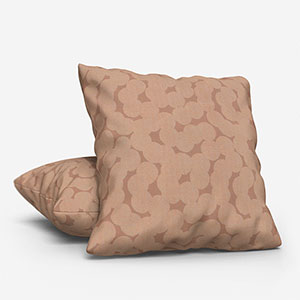
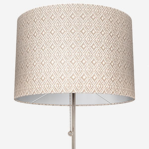
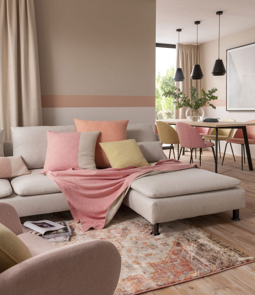
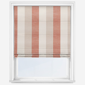
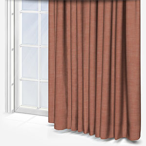
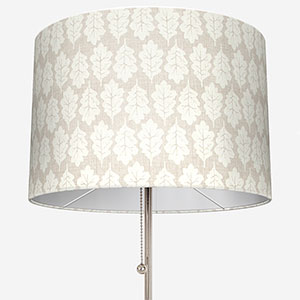
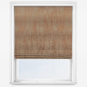
Bisque is on the richer side of the beige spectrum. With elements of tangerine, this sophisticated shade works well with richer tones on the orange spectrum. For example, if your walls are painted in a bisque colour, accents of earthy, natural oranges such as terracotta – or even pinkish corals – in a luxurious plain orange Roman blind, with similar tones in a lamp shade will look very elegant while boosting the positivity of the space.
If you’d rather look towards the lighter side of the spectrum, bisque will also work very well with paler shades of beige and ever so slightly off shades of white.
What goes with ivory?
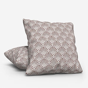
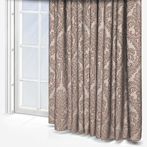
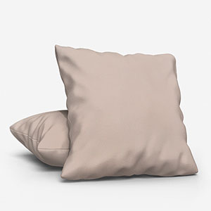
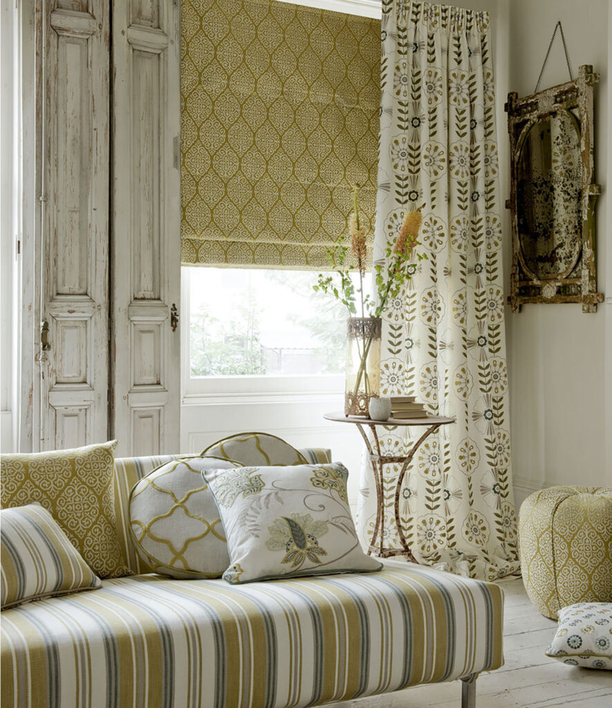
Ivory is mostly white with a light tinge of yellow. As yellow is so closely related to ivory, you could be daring and add a juicy yellow supporting colour to your ivory space. Don’t be afraid to really make the most of yellow, especially as the dominant colour in a patterned yellow curtain or a simple yellow cushion
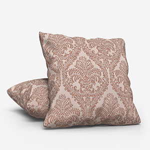
Ivory also gives you the opportunity to chose bold tones that aren’t related to yellow. For example, you can use maroon and navy blue very well. The neutrality of the colour also allows for diverse textures to be used including heavy wools and shimmering velvets.

Colours to pair with stone
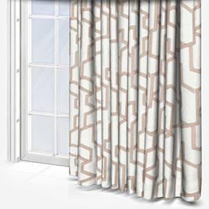
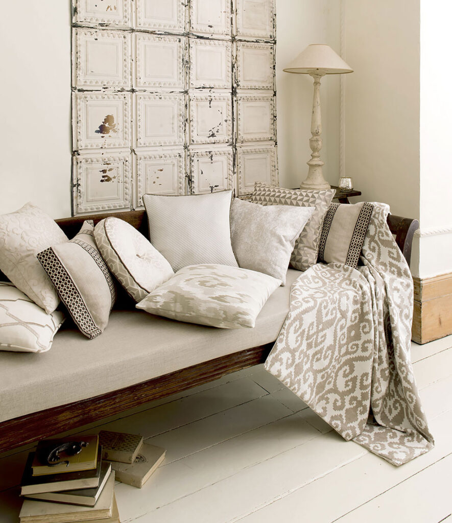
A refined saturated grey built on a khaki undertone; stone is one the bolder edge of the beige spectrum. As a result, it can be used as the statement tone, or as the dominate colour equally well. Owing to its brown-ness, stone can be well deployed with lighter cream shades and off whites, or with rich wood colours.
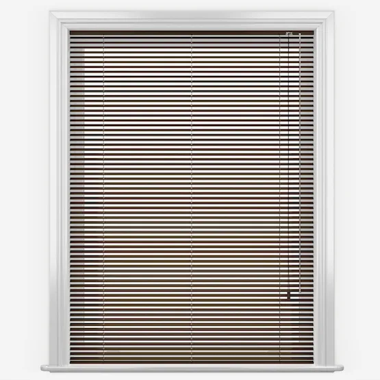
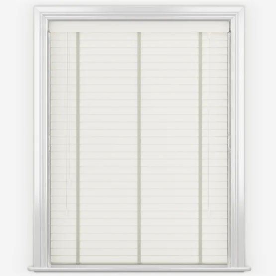
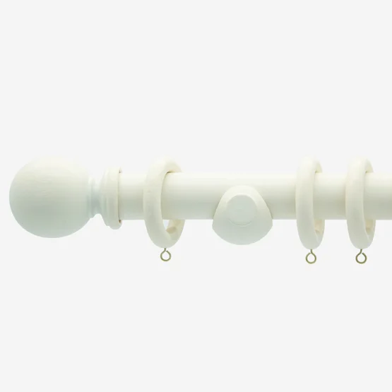
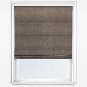
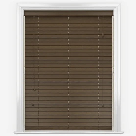
Smaller items in a light, refreshing white tone can be showcased through chairs, cabinets and white cushions. Looking to the windows, consider a walnut or oak coloured wooden blind to maintain and celebrate the natural characteristics of stone. This calming bouquet of colours makes for a relaxed environment so consider using it in a living room or even home office.
What goes with toast?
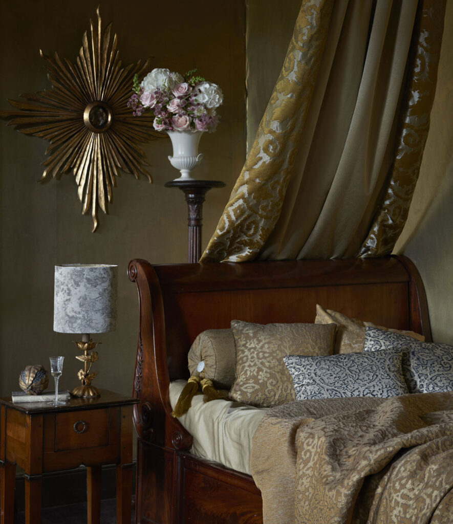
Honey, jam and of course, Marmite (I couldn’t resist!). In all seriousness, toast occupies a pleasant midground in the beige spectrum. The colour of old teddy bears and years gone by, toast helps us to reminisce and find peace.
Due to its neutrality, use toast alongside bolder, natural tones. Autumnal oranges, buttery yellows and even olive green and sage can be enhanced and enriched by toast. Beyond that, more daring designers could also consider juicier tones including peach and eucalyptus.
What colours go with cappuccino?
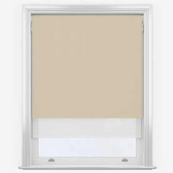
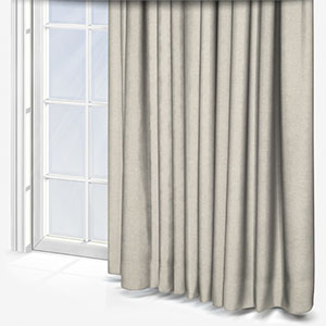
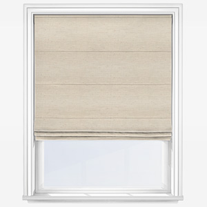
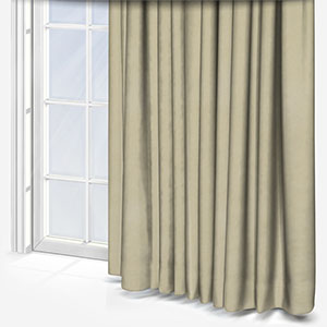
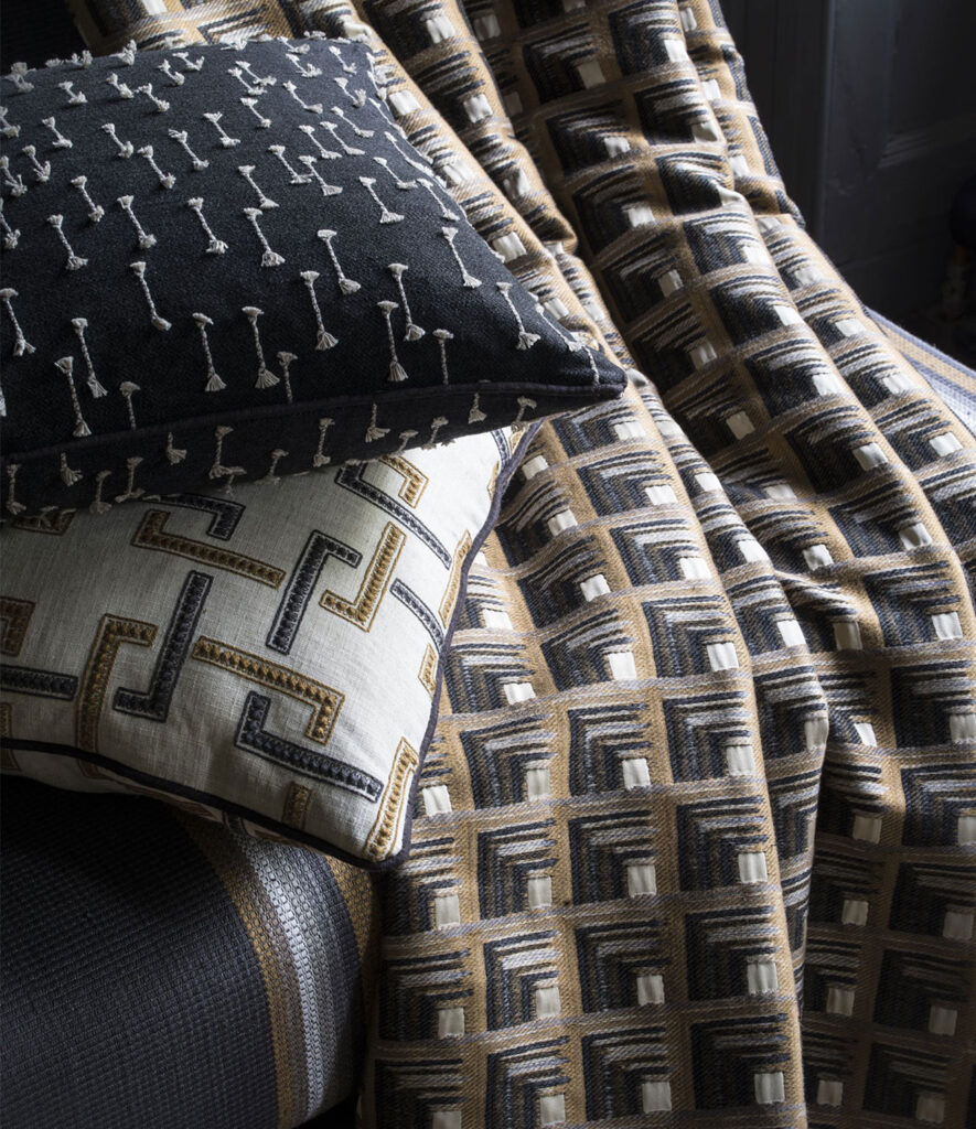
When I say cream and milk, I’m not making the same joke as above. As many readers will know from their own cappuccinos, very little looks more iconic than the brown hue of the coffee with the white swirl of the milk. This elegant contrast will work equally well within the confines of your own home. Cappuccino walls sharing the same space as a light creamy curtain or natural panel blind will make an extremely chic statement.
Furthermore, dark charcoal greys and maroons will also work well with cappuccino. To find a colour that works best in your space, you can order up to eight free fabric samples via the website!
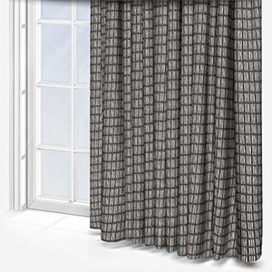
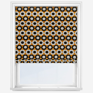
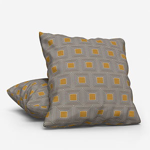
The colour beige is a great way to weave different colours into a fashionable and eye-catching interior design. If you’ve used one of the colours above as part of your beige aesthetic, let us know via social media and share photos of your stylish spaces.
Shop our recommended products for those in love with a beige aesthetic:
