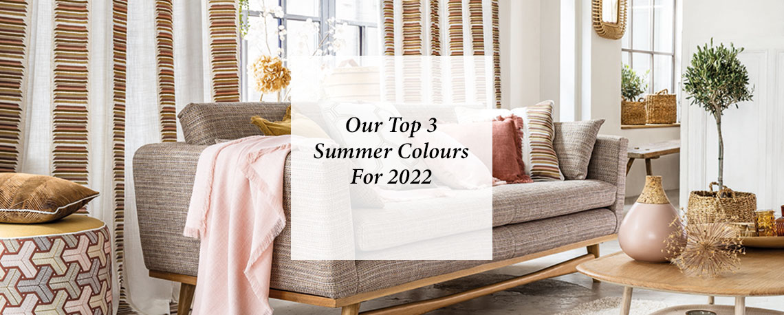
Our Top 3 Summer Colours For 2022
When it comes to interior design, finding colours that go well together can be somewhat challenging. That said, this summer there is an amazing trinity of tones that will elevate your décor, making it an energising and exciting space. These colours are orange, pink and yellow, a trio of colours which are warming and welcoming. Here’s why they are perfect for interior design.
Finding the perfect colour palette
Synergy in interior design is very important because it removes conflict and discord within the spaces where we relax. Moreover, it stops a room from feeling dull and repetitive which can crush creativity and make life less colourful both literally and metaphorically.
There are a great range of colours that enrich one another. From black and gold, to royal purple and platinum, there are many which can be enjoyed in a huge range of interior design trends. That said, there is something particularly joyful about orange, pink and yellow. These vivid colours will electrify any room’s décor be it modern or traditional in tone.
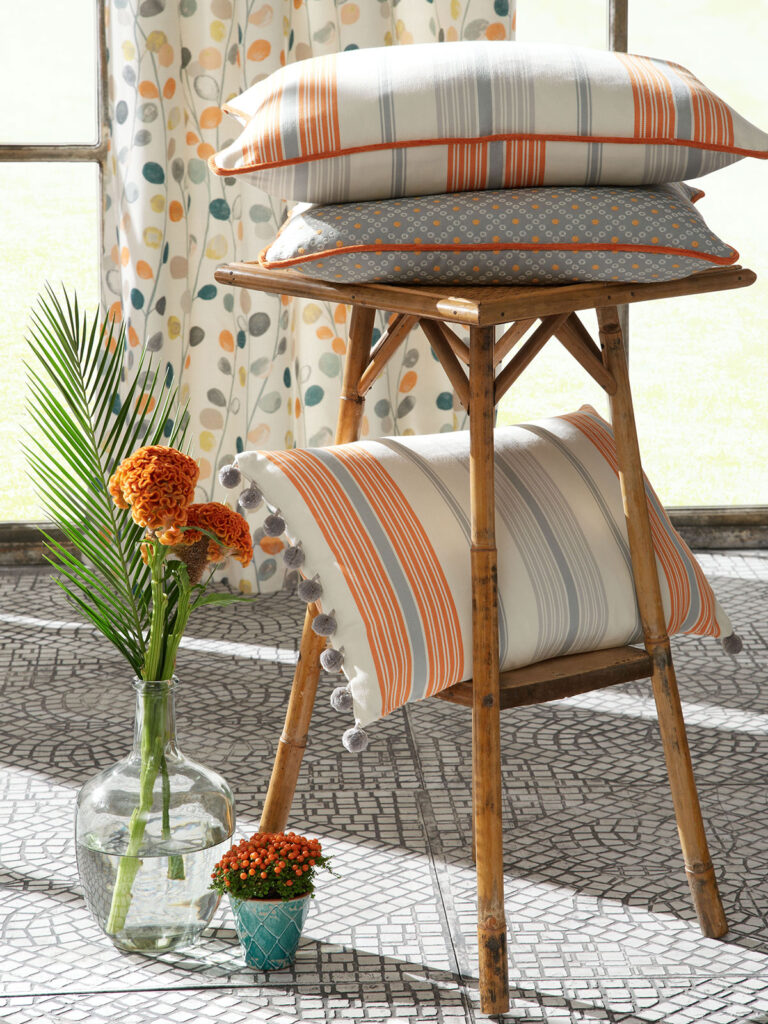
Pink and orange mix well, offering a closely related contrast on the warmer side of the colour spectrum. Yellow brings this duet up a note by remaining on the same side of the spectrum but adding a primary colour that pops and delights.
How to use orange, pink and yellow
Vibrant colour palettes may not be for the faint hearted but with only a little thought and planning, you can revolutionise your interior design! Orange, pink and yellow are all rich colours but by following these rules, you can make them support one another into a stylish décor that’s brighter than the sum of its parts.
Neutral colour base
If you want to use orange pink and yellow as equal partners, you’ll need to firstly consider a more neutral base colour. Warm neutral shades such as oatmeal and cream will avoid any garish contrasts and allow you to use blocks of today’s three colours.
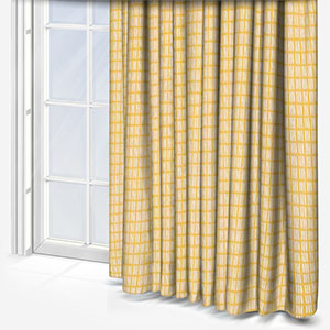
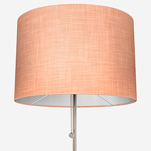
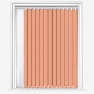
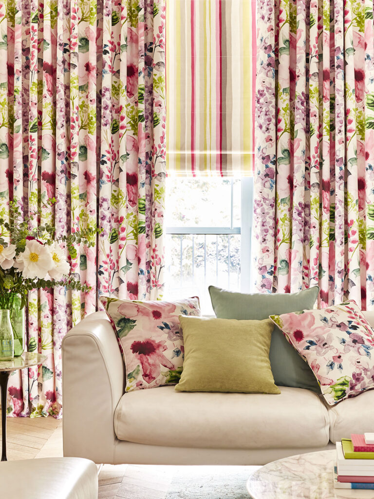
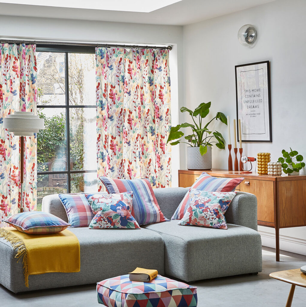
Pink roller blinds and lamp shades with beautifully patterned yellow cushions and a block orange feature wall, set amongst neutral shades, will make a space feel youthful and dynamic – especially with jewel shades of these remarkable colours. A great detail is to have a neutral curtain outside of a window recess, with a pink blind within which can be dramatically revealed.
Dusky shades and floral patterns
If you’d rather enjoy a more classically inspired home featuring these colours, duskier shades may be a better choice. Luckily, they work just as well as their jewel alternatives.
An important distinction here, however, is that where contemporary uses of orange, pink and yellow can feature a lot of block colours, it’s better to use duskier shades in traditional patterns.
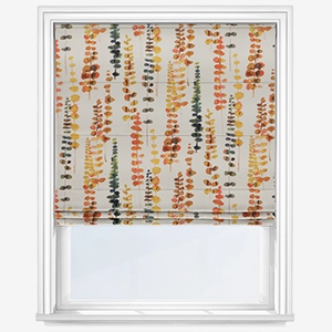
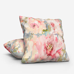
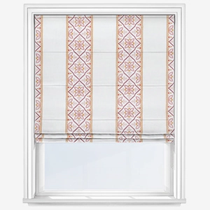
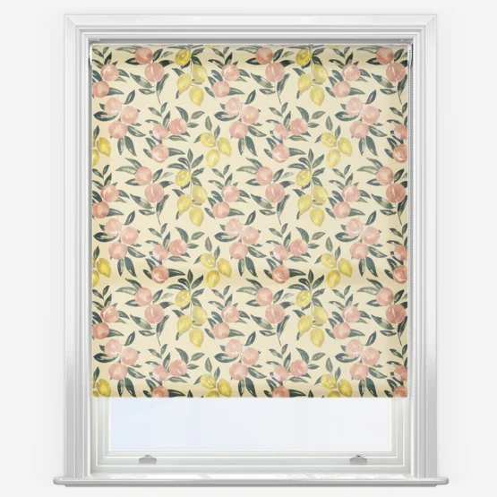
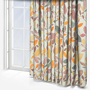
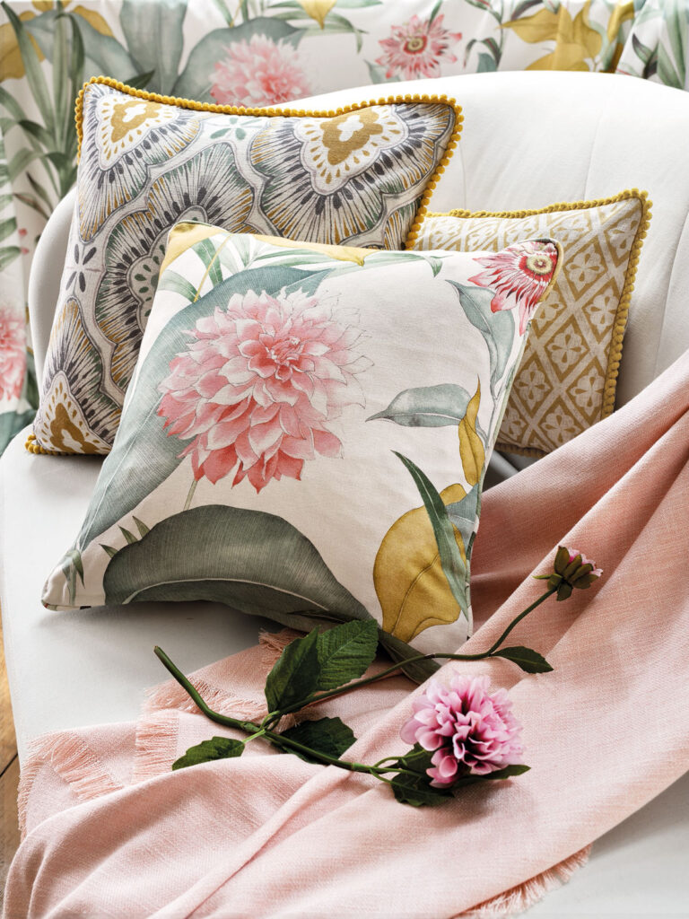
Floral patterns comprising orange, pink and yellow, or even soft geometric shapes are great ways to inject these colours into your home.
Which colours work well alongside orange, pink and yellow?
Bold colours are always fun in interior design but finding other colours to reign them in is super important. Firstly, since orange and pink are created using red, it’s wise to leave this fiery colour out of the colourway. That said, you can then start to look at other colours as long as you keep them soft and powdery. The juicier orange, pink and yellow, the softer the foundation colour must be.
Beyond the creamy shades referenced above, you can look to pale greys and even blues and greens. These last two colours should be on the greyer side of the spectrum because if they are too juicy, they’ll start to clash with our statement colours, making the whole space feel out of balance.
Many readers may be considering how white works with today’s triumvirate and while it shouldn’t be a leading colour alongside orange, pink and yellow, you can certainly use it within patterns that feature our star shades.
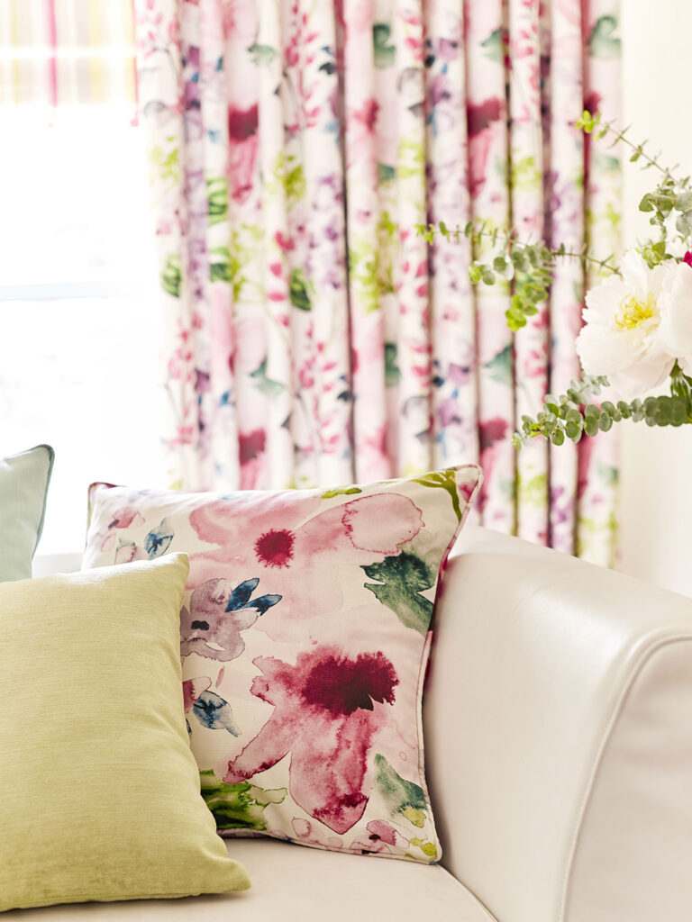
Finding colours that go well together is something that’s very much worth doing and while it may take time, there are ways to speed the process along. At Blinds Direct, we have an excellent array of colours including orange, pink and yellow, alongside everything from purple to brown. To help you find the perfect colours for your home, we also offer up to eight free samples! Check out the range today and find your ideal colour combo.
Shop some of our products inspired by orange, pink and yellow:
